Skip to content

Month: September 2009

Introducing the WSJ.com News Hub

Last week the Online Journal introduced a new live video feature, the News Hub. The 10-minute segments run twice a day, at 8:30 a.m. and 4:00 p.m. and are filmed about 15 feet from my desk. (You can occasionally see the back of my head in the video.)

In many ways, I think this is a great development. When I first came to the Journal in 2005, we couldn’t even embed video on our site. And now we’re putting out a live program twice a day. Print reporters are increasingly interested in working with WSJ.com and in doing things like video, which is how it should be. Of course, they also know that they have to do this sort of thing if they want to stay relevant and, frankly, keep their jobs. I’m not sure how comfortable everyone is with that.

Although the Journal doesn’t exactly have any fancy sets — or even a real desk — it does have a lot of smart, real business reporters. Honestly, I’d rather watch people like that than people who are more polished but less knowledgeable.
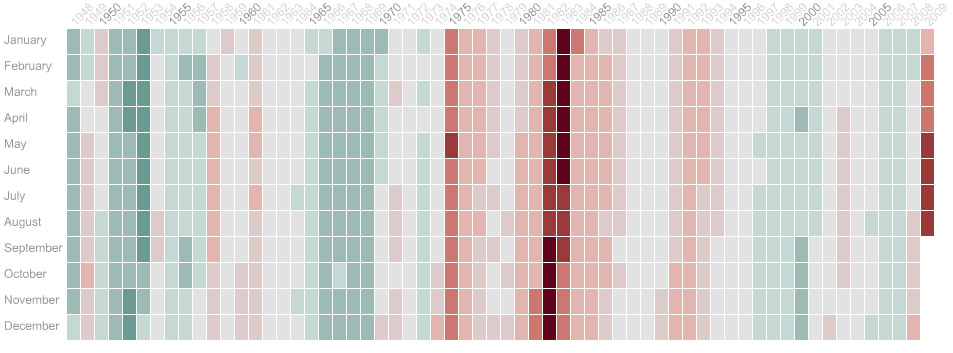

Grid Graphic: U.S. Unemployment Rate

The above is an image from an interactive graphic my colleagues Susan McGregor, Mei Lan Ho-Walker and I (but mostly Susan) produced for the Online Journal. The actual version is here.

Basically, each of those little boxes represents a month. As the unemployment rate rises, the color in the box goes from green to red. You can see on the interactive version that our unemployment rate is still worsening but that it isn’t yet as bad as it was during the recessions of the 1980s. The graphic also allows you to see that unemployment often continues to worsen even after a recession is officially over — not necessarily good news for job seekers in the U.S.

The graphic itself is a new way to look at this sort of data over time. Usually, unemployment numbers are presented as a simple line graph, but the grid-and-color system allows you to provide more granular information in the same amount of space. By using colors instead of the Y axis to represent numbers, the graphic allows the Y axis to serve a new function. Each month is easily visible, and in addition to seeing its unemployment rate, the reader can click a button to see whether that month was officially part of a recession. Even more information, such as the dates of economic shocks or the political party in power at the time, may be added later.

Unfortunately, because this is not the way we are used to visualizing this type of data, it can take a few minutes to get used to the format, and this is something I think we’ll need to work on.