Skip to content

Category: Journalism

What They Know

Note: Several years after publication of this post, the Journal’s graphics server was hacked. Portions of the online graphics related to this series may not be available.

For the past few months, my editor, Julia Angwin, has been leading a team looking into the use of information gleaned online and through other technology to compile dossiers of people and their preferences. The screen shot above provides a visualization of the primary database in this project — a look at the “trackers” on the 50 top websites, and the companies to which they send data about visitors’ browsing habits.

The full graphic, available here, gives a good snapshot of what’s going on in the burgeoning field of behavioral advertising, a complex and rapidly expanding field that is coming to rely on “big data.” And it raises plenty of questions for consumers; it’s not always clear what is done with the data or how long it is kept. Much of the data collected on browsing habits does not contain what’s known as “personally identifiable information,” such as name and Social Security number. But as dossiers become more comprehensive, researchers say such precautions don’t mean the profiles are actually anonymous.

As part of this series, which the Journal is calling “What They Know,” I wrote up some instructions for maintaining privacy online. And we’re working on some other exciting things. So stay tuned.

News on Haiti: Popular, Also Unpopular

The tragedy of the earthquake in Haiti has obviously captivated people’s attention over the past few days. People are donating, tweeting and searching for news about the quake. So why do the most popular stories on many of the top news Web sites have nothing to do with Haiti?

The Haitian national palace. Photo by the U.N

The top items at WSJ.com right now include an interview with Glenn Beck and article about pay at banks. And it’s not just that Journal readers’ politics make them more likely to be interested in those topics; the New York Times isn’t currently listing any Haiti stories among its most read either. On the BBC, stories about Haiti are trumped by a video of a dog that understands Polish.

The Times post linked above suggests that people can’t cope with the scale of the problem, and so they watch pet videos instead. I think that might be true — except for the fact that people actually are coping with the problem as much as can be expected. They’re donating in record amounts through text messaging and the like; it might not be much, but it certainly could be less. Most people realize they can’t physically go to Haiti and save people, but they aren’t being completely inactive, either.

So what’s the answer? I don’t know. I’d guess, though, that people are just successfully compartmentalizing the news and quickly making decisions about what actions (like donating) actually help them cope and what actions probably wouldn’t do much at this point except make them sad.

Introducing the WSJ.com News Hub

Last week the Online Journal introduced a new live video feature, the News Hub. The 10-minute segments run twice a day, at 8:30 a.m. and 4:00 p.m. and are filmed about 15 feet from my desk. (You can occasionally see the back of my head in the video.)

In many ways, I think this is a great development. When I first came to the Journal in 2005, we couldn’t even embed video on our site. And now we’re putting out a live program twice a day. Print reporters are increasingly interested in working with WSJ.com and in doing things like video, which is how it should be. Of course, they also know that they have to do this sort of thing if they want to stay relevant and, frankly, keep their jobs. I’m not sure how comfortable everyone is with that.

Although the Journal doesn’t exactly have any fancy sets — or even a real desk — it does have a lot of smart, real business reporters. Honestly, I’d rather watch people like that than people who are more polished but less knowledgeable.


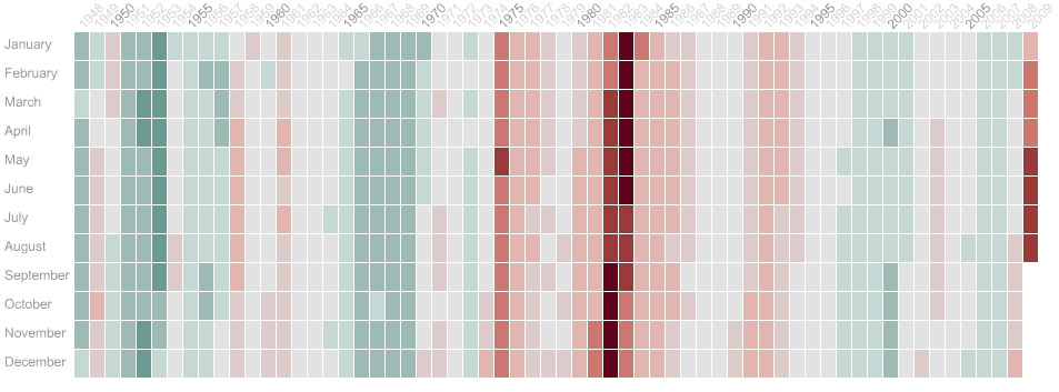
Grid Graphic: U.S. Unemployment Rate

The above is an image from an interactive graphic my colleagues Susan McGregor, Mei Lan Ho-Walker and I (but mostly Susan) produced for the Online Journal. The actual version is here.

Basically, each of those little boxes represents a month. As the unemployment rate rises, the color in the box goes from green to red. You can see on the interactive version that our unemployment rate is still worsening but that it isn’t yet as bad as it was during the recessions of the 1980s. The graphic also allows you to see that unemployment often continues to worsen even after a recession is officially over — not necessarily good news for job seekers in the U.S.

The graphic itself is a new way to look at this sort of data over time. Usually, unemployment numbers are presented as a simple line graph, but the grid-and-color system allows you to provide more granular information in the same amount of space. By using colors instead of the Y axis to represent numbers, the graphic allows the Y axis to serve a new function. Each month is easily visible, and in addition to seeing its unemployment rate, the reader can click a button to see whether that month was officially part of a recession. Even more information, such as the dates of economic shocks or the political party in power at the time, may be added later.

Unfortunately, because this is not the way we are used to visualizing this type of data, it can take a few minutes to get used to the format, and this is something I think we’ll need to work on.